My studio plan
As I consider myself an ameteur in photography, I did not pay too much attention to the assortment of Light Shaping Tools. The main source of light came from the softbox in front of the models. Thanks to it I was able to create a beautiful soft light that was ideal for this kind of studio shoot. On some occasions we also used a reflector. But it was more of an experiment to see how we can shape the lights. The pink background was not our choice. I don't remember very well, but it might have been chosen by one of the teachers. I am not saying that it was a bad idea, it just was not my style.

The aim of my studio shoot
The main task of this photo shoot was to take pictures of models in costumes, to later use them for our Chi Fest project. Since I was selected as the the main photographer in this photo shoot, I have been also in charge of giving the models advice for their posing. My responsibilities also included the balance and setting of lights and reflectors. It is funny, but I almost felt like a real artist by giving them orders which they later obeyed. The conclusion was, that I got photos which spoke to me.
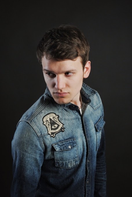
Juliet and Ania prepare themself for the photo shoot...
Having fun was essential
Images I have chosen to edit
From a huge selection of photos I chose only a few, which may work well with the aim of this project. In my mind most of them were perfect to work with. However due to the limited time I had to focus only on the photos with a clear and easy composition. It is also worth mentioning that the pictures I have chosen were already giving me some hints what to do with them.
Health and Safety- I wouldn't call it a 100% safe area to work. Since we brought many costumes and tools to make this photo shoot interesting, the room was literally overloaded with un-necessary objects compiling around. Since we had a lot of fun there it got a little bit chaotic. But there was no real danger visible.
My edits
As mentioned above the photos were almost ready. I didn't had much use of photshop. I used the crop tool to normalize the composition. Brigntess and Contrast have been essential like always to seperate the model from the background. Finally I rasterized the picture with the raster tool. The Union Jack is a visually pleasing design, so I merged it into the picture. Afterwards I played a bit with my faovorite tones.
Looks quite good in my opinion. Perfect combination of colours. Brightness and contrast.
This design would speak perfectly to the youth. Quite good concept.
It doesn't fit to the Chi Fest poster. I should have add one colour to it.
More colours and a bit more life. The british flag fits the composition well.
Evaluation
I had in mind to create a design which would fit the topic of Chi Fest or the now renamed ''Music and Food Festival''. My idea was to create a poster which would speak to the everybody by promoting its originality. I wanted to create an ''eye-catcher'' with a bit of surprise behind it. The female models were quite young and good looking, so I rejected the idea of using males. The costumes that were available brought the idea of a festival into motion. In other words the studio plan had been set to very high standards. The photography equipment was available and ready to use. The teachers were ready to assist us at all times. I did many basic mistakes. Starting with the equipment, I was not able to set the settings on my Canon camera. I later solved this problem thanks to the teacher and my friends. The softbox was quite easy to handle, same as the reflectors. However I couldn't deal with the costumes the models were wearing. I felt the need to have a balance between the pink background and costume colours. Overall we overcame this problems by just having fun. The final designs are not ready yet, but I feel that they are progressing in a good direction.