My book covers for Beautifully Unhinged
Photographic experiment/ illusion
It was not an easy week...But I finally made it!
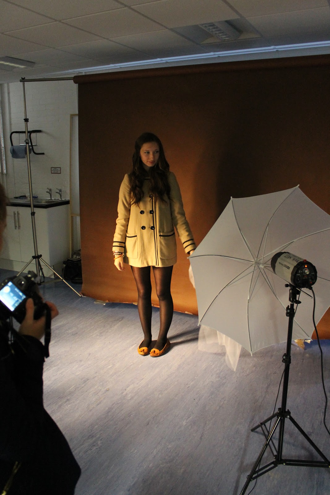
After spending many hours at home, at school, outside, inside, here and there and taking hundreds of photos, I finally reached the moment where I could select a few of them to use them as my final book cover designs. All my photographs have been taken with a Canon EOS 1100D, which I later transferred onto my computer.
I have been using two graphics packages: CorelDRAW Graphics Suite X4, and Photoshop Cs4. However, I spent three quarters of my time working on Corel at home. To complete the book covers, I used several graphic techniques. One of them was the layer cloning technique which I used to create the blue cover. After adjusting the photo featuring the model to the background, I then took a template of some old bricks. Then, to make the wall look more worn and "old school", I copied the template and duplicated it with different opacities and different tonal effects. This made the bricks appear much more interesting. To finish off the main object in the foreground, I played a bit with the Brightness/Contrast tool, which can be found in Menu, Effects.

During my work with the photos, I was inspired by some of the book covers of novels written by Stephen King, the author of some of the most famous horror/thriller novels. Although his books have been published by many different companies, there were two in particular which inspired me the most. The first book was ''Full Dark, No Stars'' with the blue cover, published by Scribner. The same cover has also been published in the UK upside down, which gave the book, in my opinion, a completely new look. I also paid a lot of attention to the colours, which were very limited (mainly blue or black, if you can count black as a colour). The second book from which have taken inspiration is "The Stand" published by Signet. Although I read it many years ago, the book cover brings me some memories back, when I was in Highschool. I have also chosen this book cover because of its simplicity and "cool attitude". The colour is mainly red, and the front image shows the grim reaper on a horse.
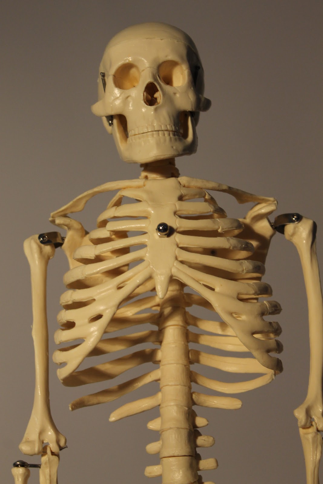
I present four book covers, in different colour and texture variations. Some of the colour concepts are stronger than others. For the typography, I have also used various fonts, albeit of a similar style (Arial Narrow, Arial Black). because I wanted to keep the letters simple and elegant.The graphic topics of the book are also different in many ways, but all have one thing in common, a dark character. One design shows a skeleton, and yet another one tells a story of a depressed teenager. It seems to me that there is a lot pain and suffering in this book, which for me has a stronger message to the world than happiness and frivolities.
Altogether I am satisfied with my final book covers. There are of course places where I can say "I could do this better'' or " I would change this or that", but it is more important to me that the work has been done on time. It was also the first time that I have worked on one art piece using two graphic programs. In the near future, I would like to improve some of my skills using Photoshop. I also would like to discover new functions and tools on Corel that might enable my artwork to rise to a completely new level.